Pollen UI
Creation of a brand new design language to improve conversion and scale into travel.

Pollen is a technology company that builds, curates and delivers the best experiences all over the world leveraging a data-driven, customer-led mindset.
In early 2022, another Lead Product Designer and I were selected by the VP of Design to undertake the development of a brand new UI and design system. Across the six month project, we worked closely with teams to implement our design changes across all of Pollen’s products.
Pollen’s existing UI was minimal and inconsistently applied. It worked well for the company’s earlier focus on EDM events but was not suitable for their move into broader music-led travel experiences.
The lack of visual consistency and usability across the full user journey reduced trust and contributed to lower conversion rates.
The old Pollen UI
We aimed to make the booking process more intuitive and engaging - reducing friction during checkout, surfacing key information at the right moments, and building visual trust to help users feel confident completing their purchase.
The existing UI heavily reflected EDM subculture. We needed to evolve the visual language to resonate with a wider audience seeking curated travel experiences, without alienating the existing fan base.
By creating a clear, modular design system with documented foundations, we helped designers and developers move faster, stay aligned, and produce on-brand experiences more efficiently.
We led a six-month UI overhaul and design system creation, collaborating with product and research teams. We audited design elements, prototyped new styles (type, color, spacing, dark mode), and user-tested with real customers. A full design system was documented in Zeroheight and handed off to engineering, paired with regular design syncs to ensure smooth adoption.
We ran workshops with the wider design team
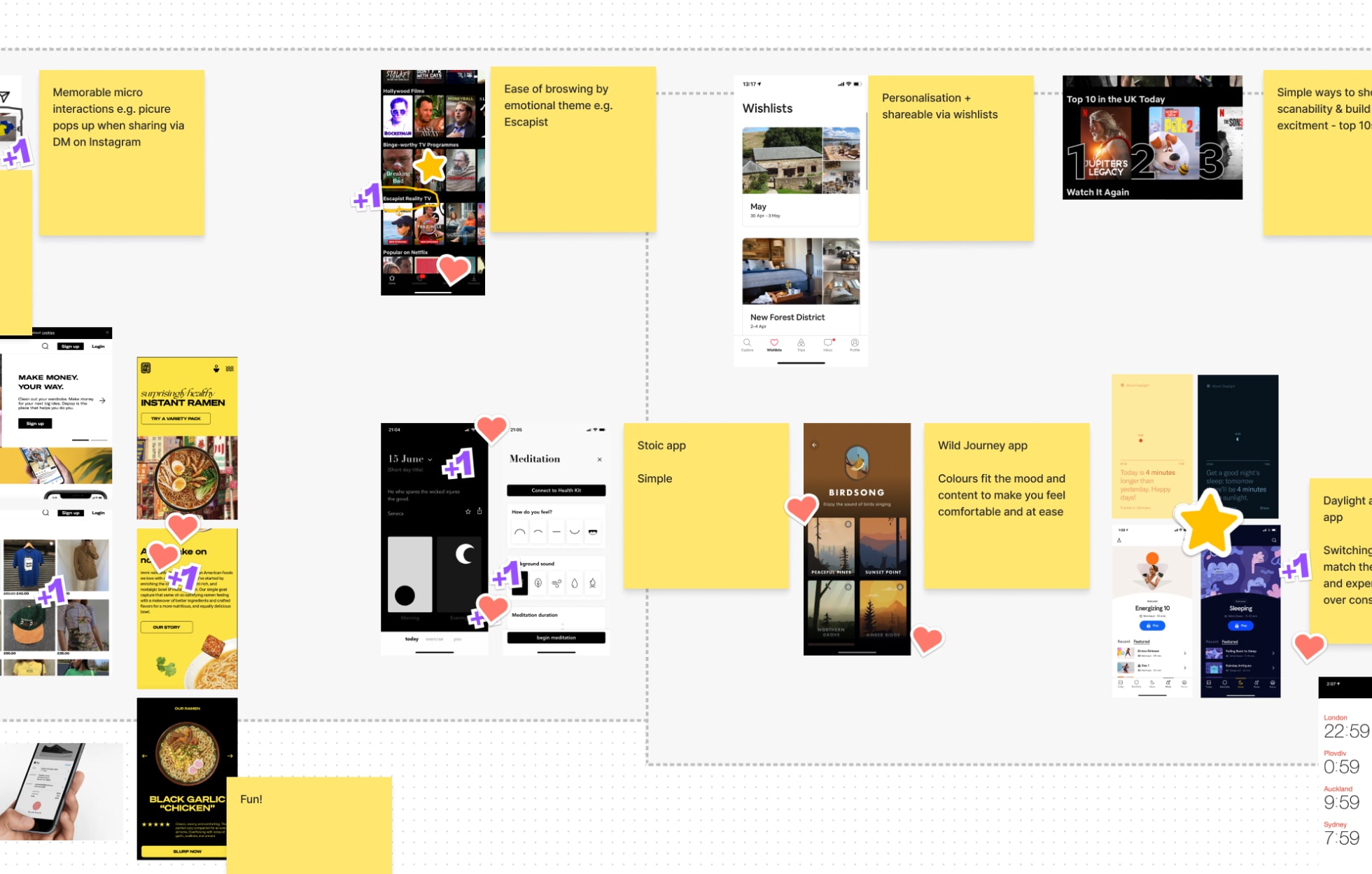
We created prototypes to test type, colour and spacing as this gave us the freedom to explore how we could implement a variable font and components using a dark UI.
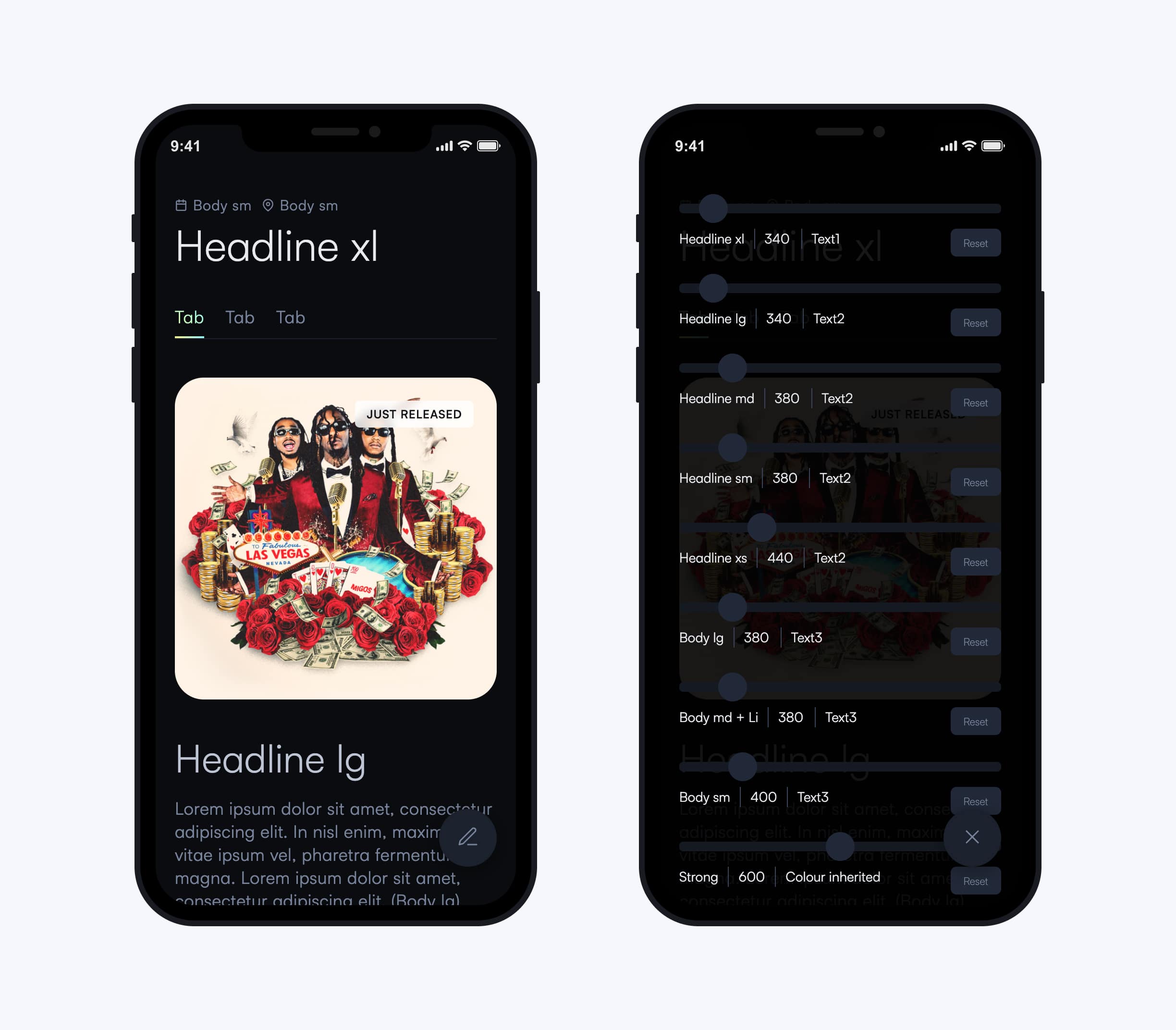
Prototype to test variable font and dark UI
We landed on a proposed direction and ran a workshop for the entire design team to give feedback and test the UI in their area of the product. Overall it was agreed that the end result was aligned to the needs of the wider audience and gave us consistency across the product.
The new UI was implemeted and user tested with new and existing customers and the feedback was postive.
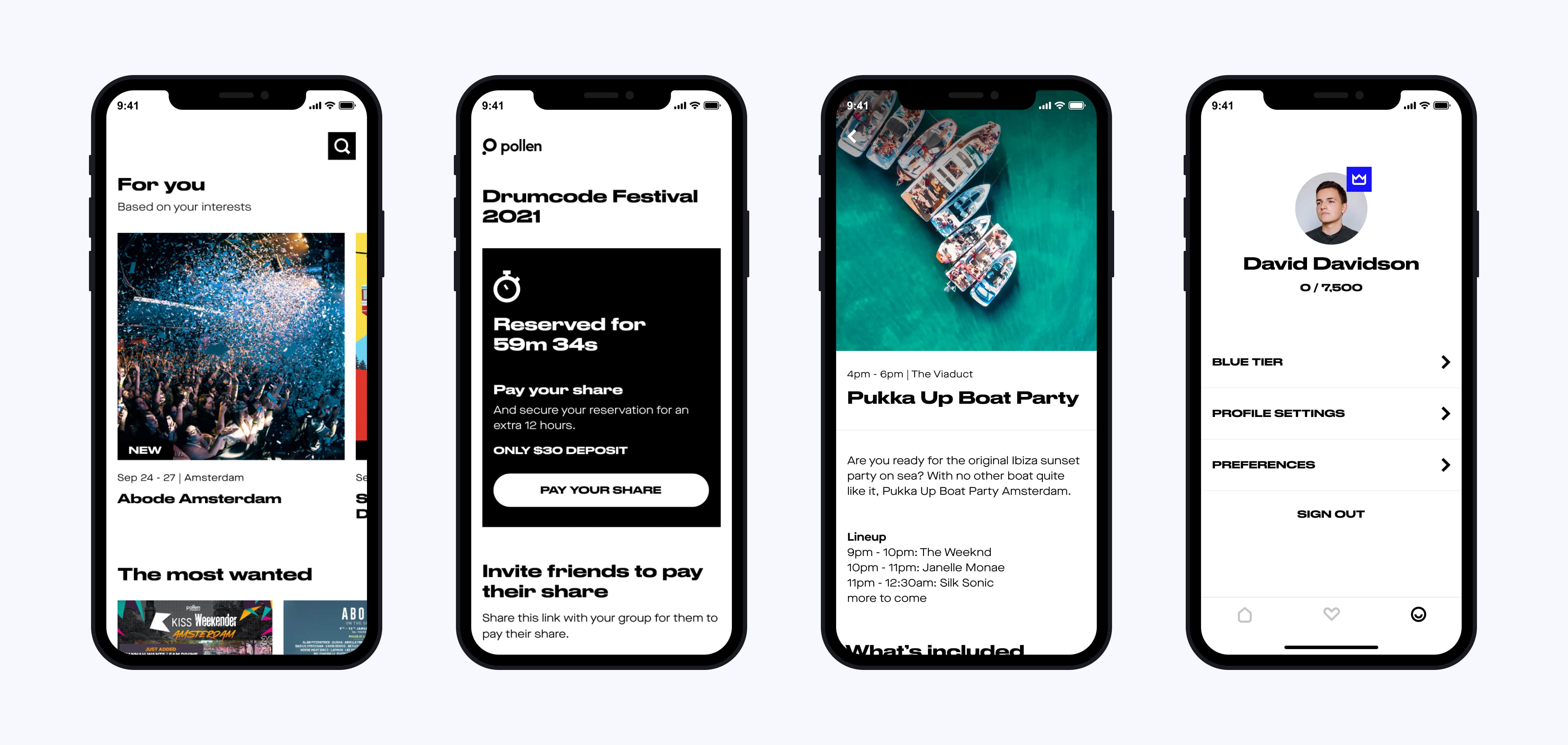
The first page of the app is our best opportunity to deliver personalised recommendations and draw customers in. The previous design was repetitive in style and lacked brand awareness. The new design utilises softer corners, brand integration and video trailers to generate excitement.
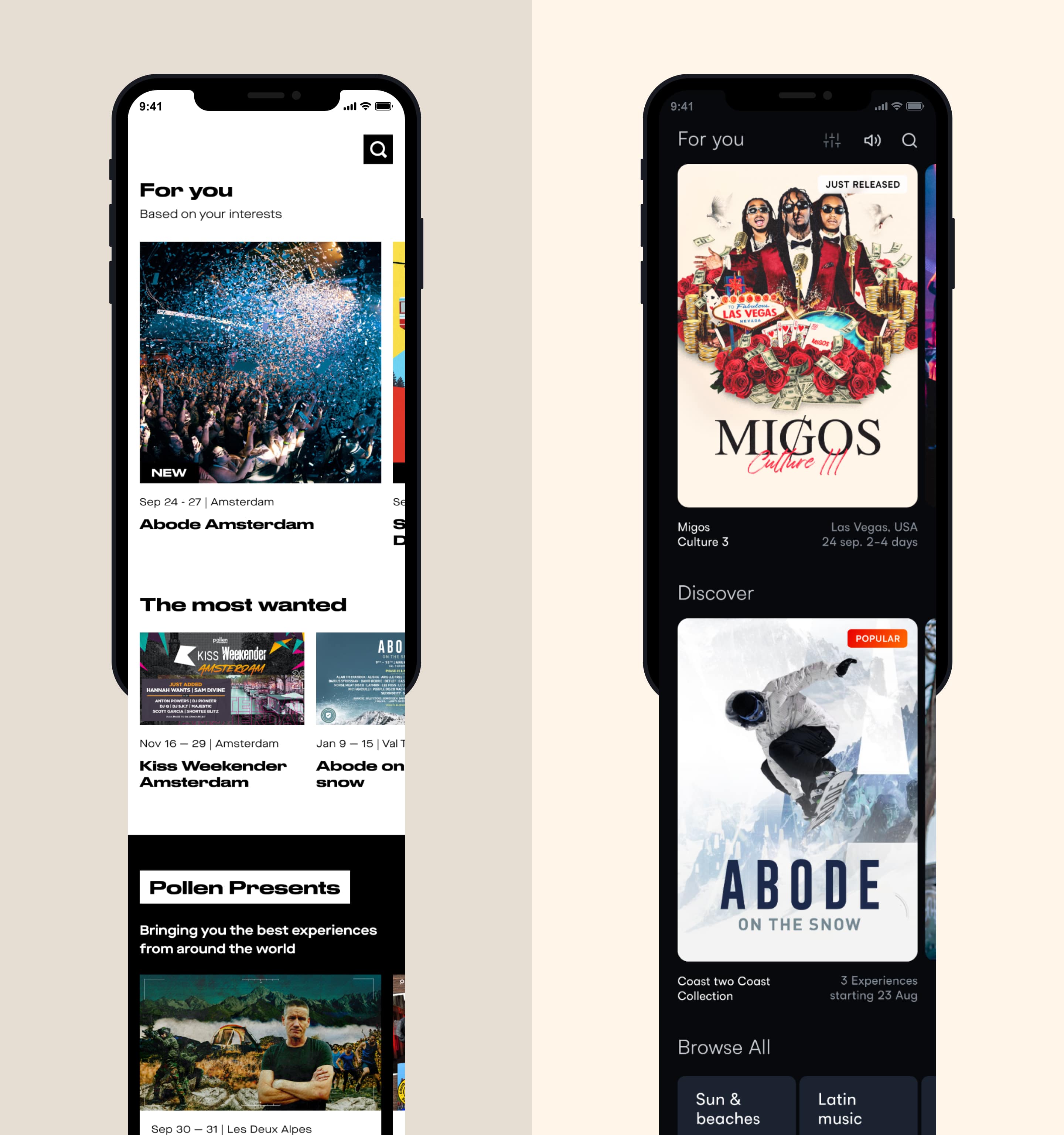
Discover events screen
When finalising a booking with Pollen, we wanted the customer to feel excited. It’s also a critical moment for conversions - if the full group didn’t pay within 12 hours, the booking was lost. The previous design overwhelmed users with information and fell short of delighting the customer upon checkout. The new design brings brand awareness from the discovery page right through to the last stage, building trust.
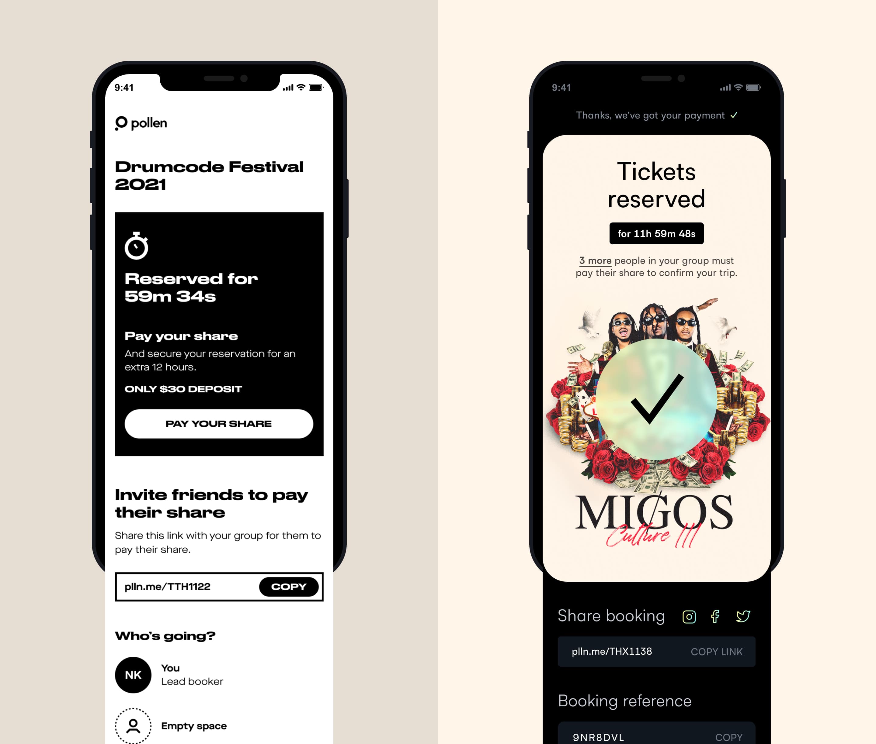
Tickets reserved screen
This is a focal point of the app’s In-Destination feature. When customers arrive at an experience, they need to quickly access their itinerary and figure out their next move. Upon arrival, the event itself becomes the focal point which means the faster users can get the information they need, the more successful we are. To cater for this, the new design elevates upcoming events and assists planning your day with information including walking distances and prominent event start times.
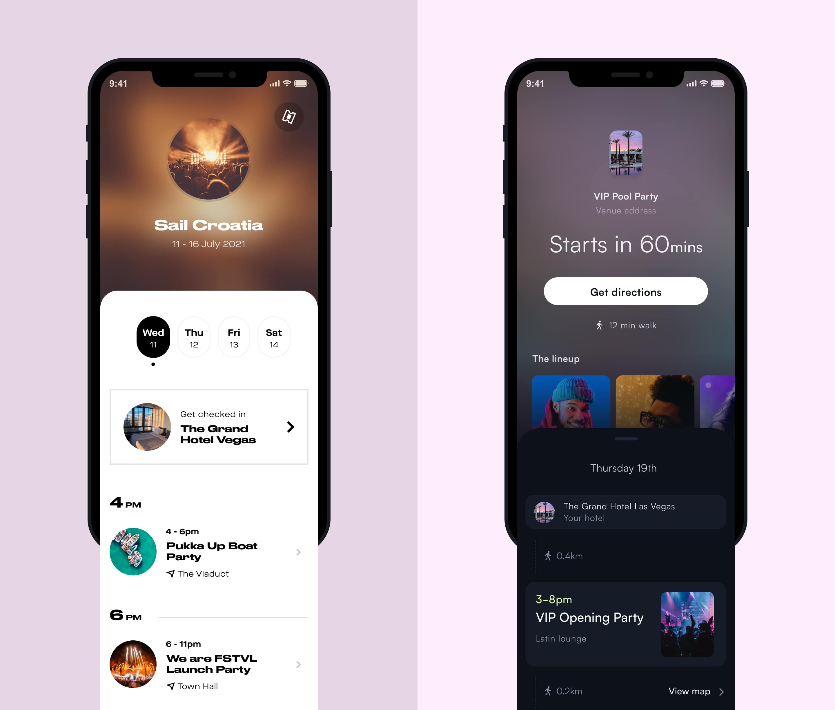
Itinerary screen
Qualitative and quantitative research methods emphasised the importance of line-up insight when attending an event. The new design has this as the most prominent feature. It separates headline acts from the full list below but also offers access to the full event details if needed.
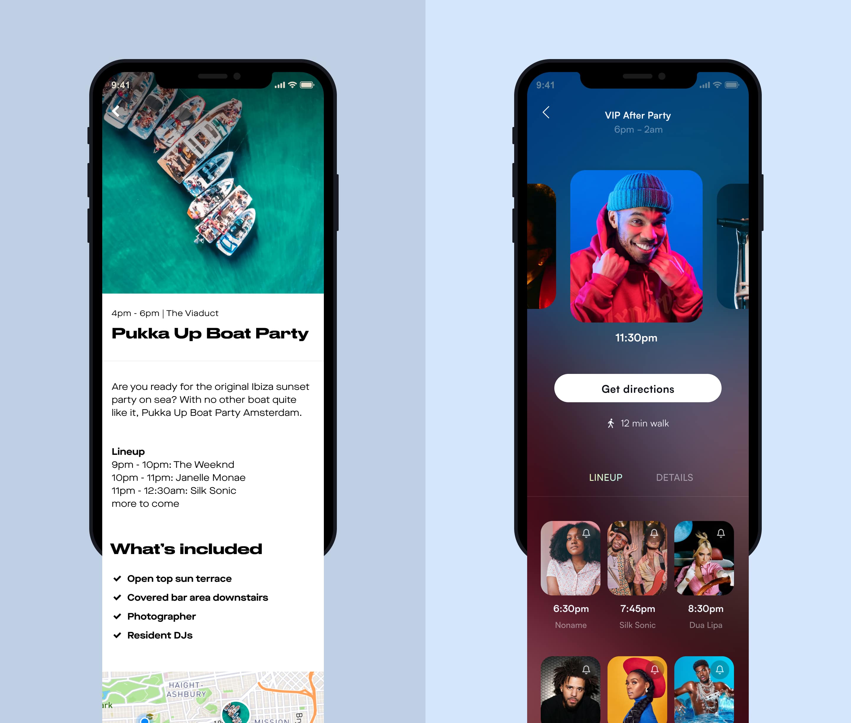
Event details screen
The profile area was not effectively communicating the benefits of the rewards programme such as pre-sale access and exclusive VIP extras. The new design surfaces progression metrics and core benefits.
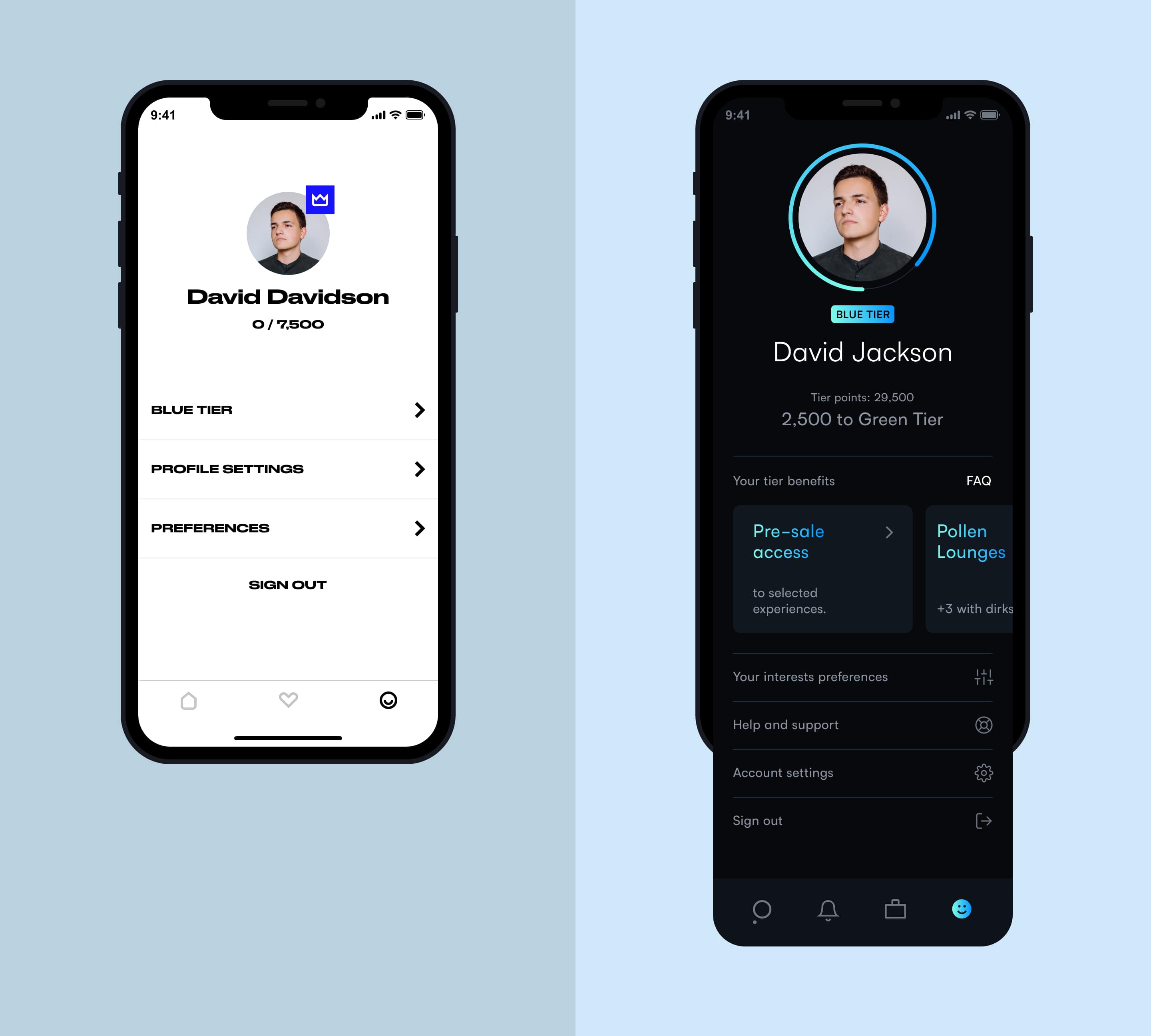
Profile screen
In order for the rest of the design team to benefit and utilise any style changes, we needed to define solid design foundations.
A range of colour scales and tints were explored when we made the switch over to dark theme. Each one was accessibility tested.
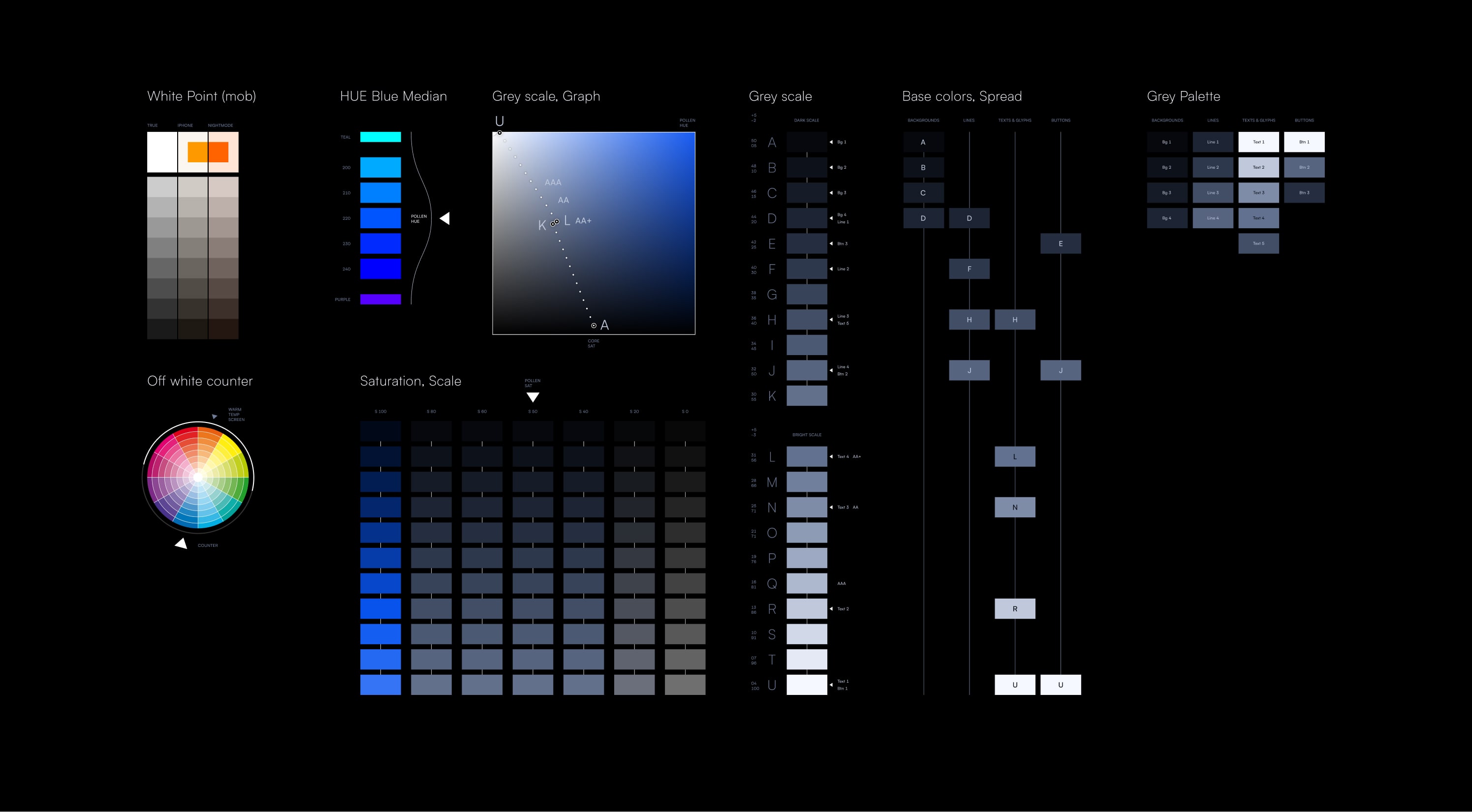
Testing colour scales and tints
To support scalability we implemented colour tokens from the chosen colour scale. This makes it extremely efficient to target an exact sub-set of colours when adapting the design language in future iterations.
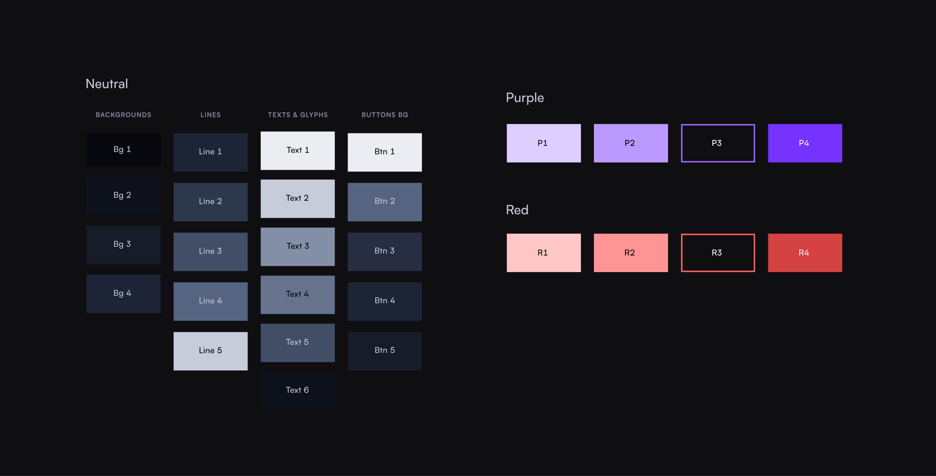
Using colour tokens to scale
To create hierarchy and balance across the product, we implemented elevation levels and colour palettes.
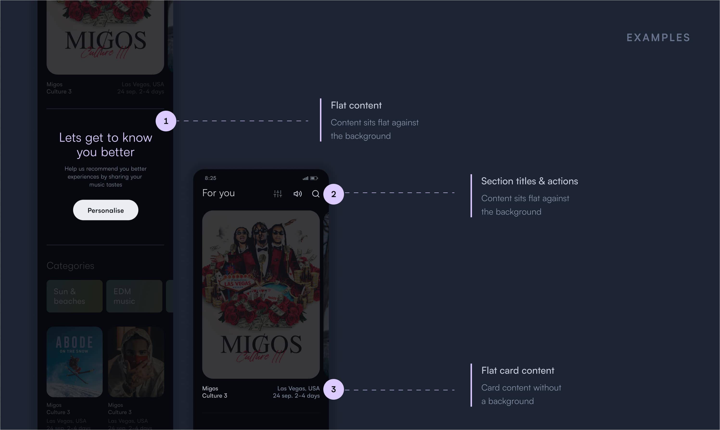
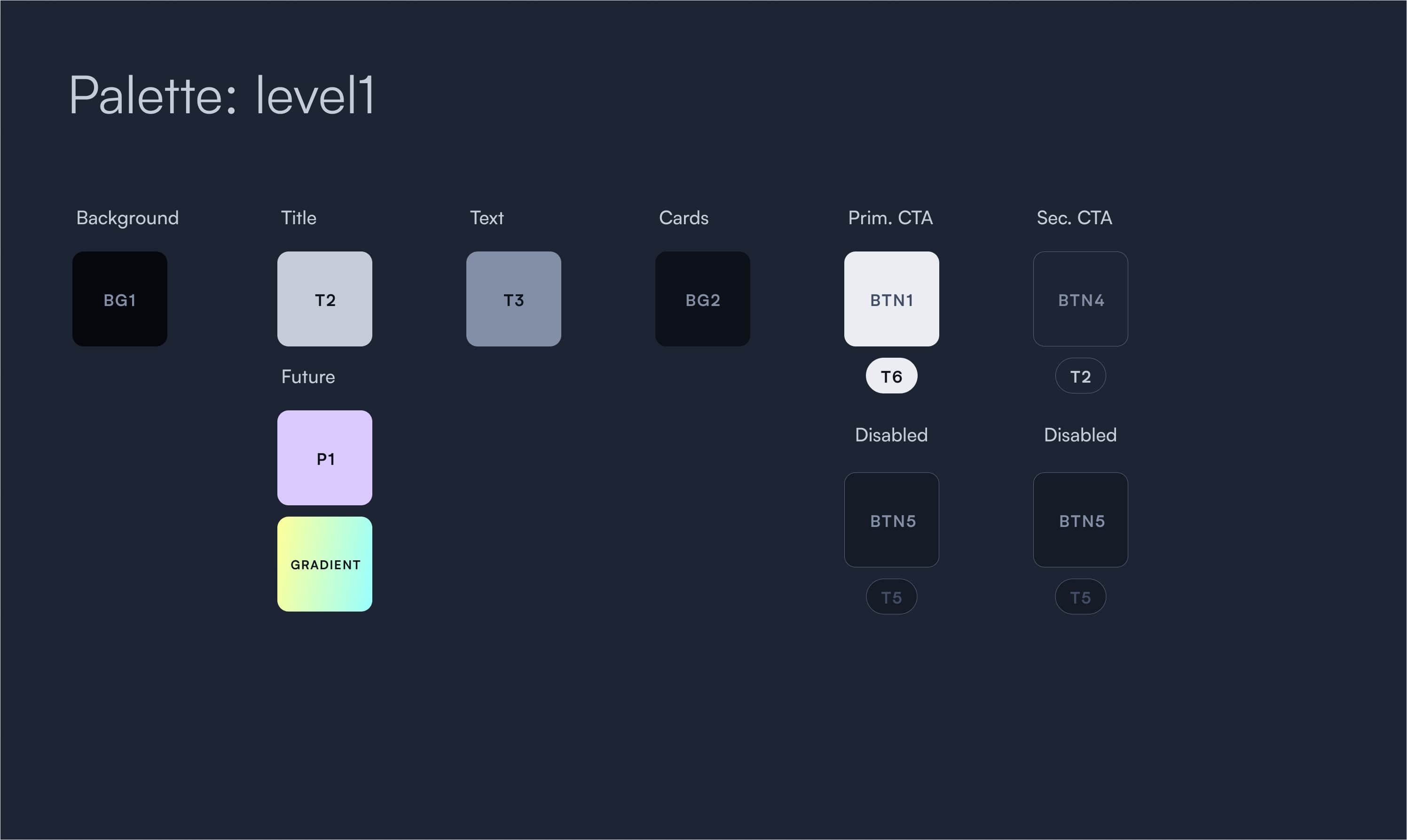
Elevation 1
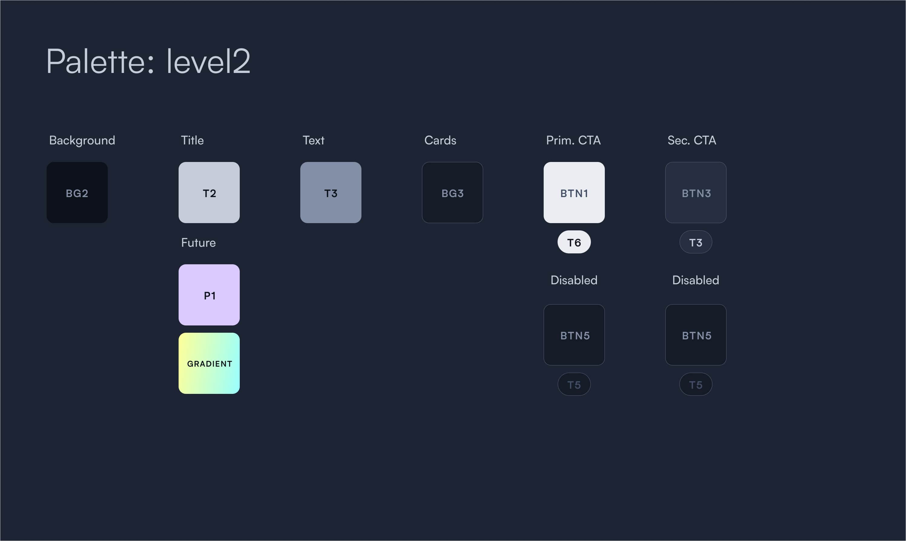
Elevation 2
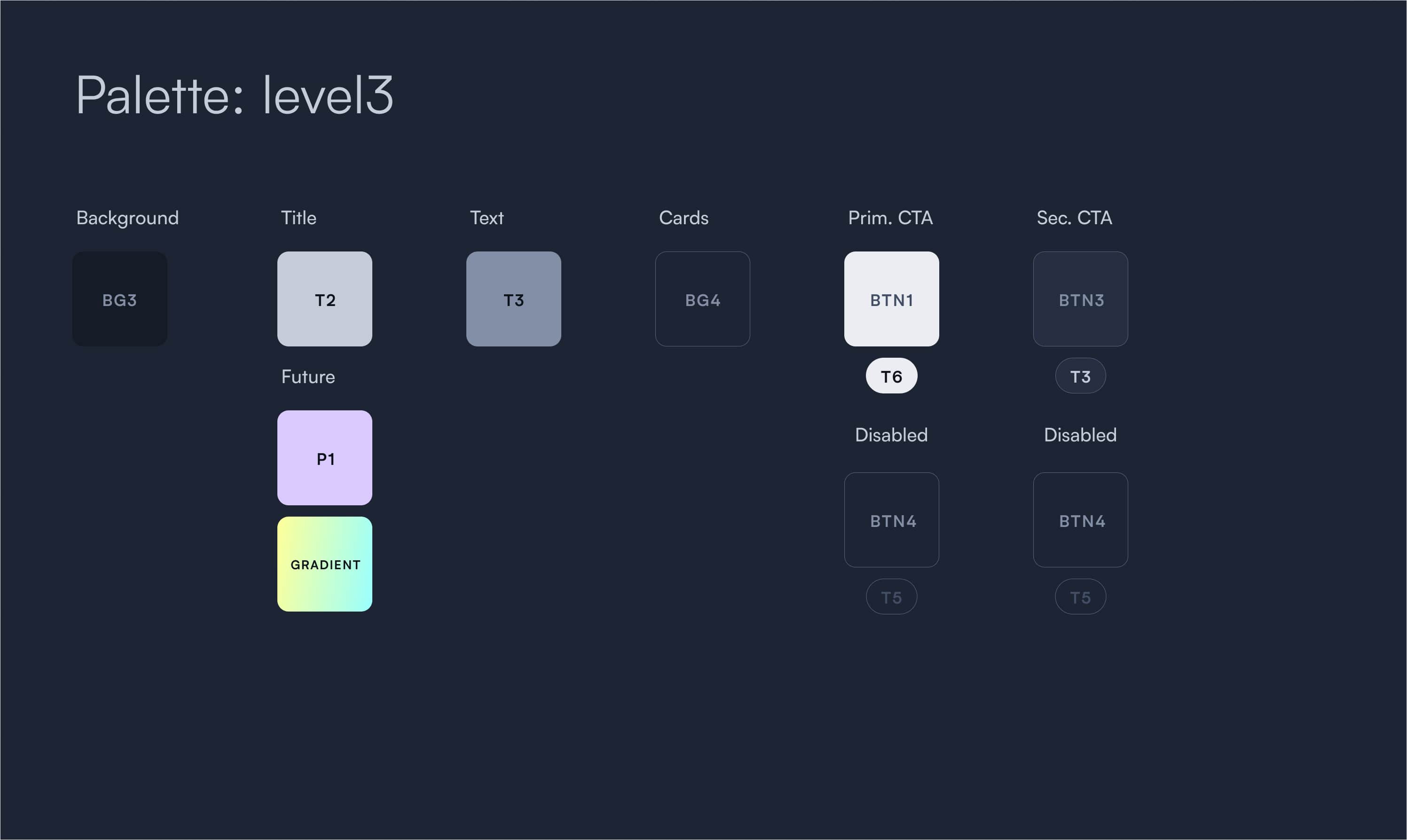
Elevation 3
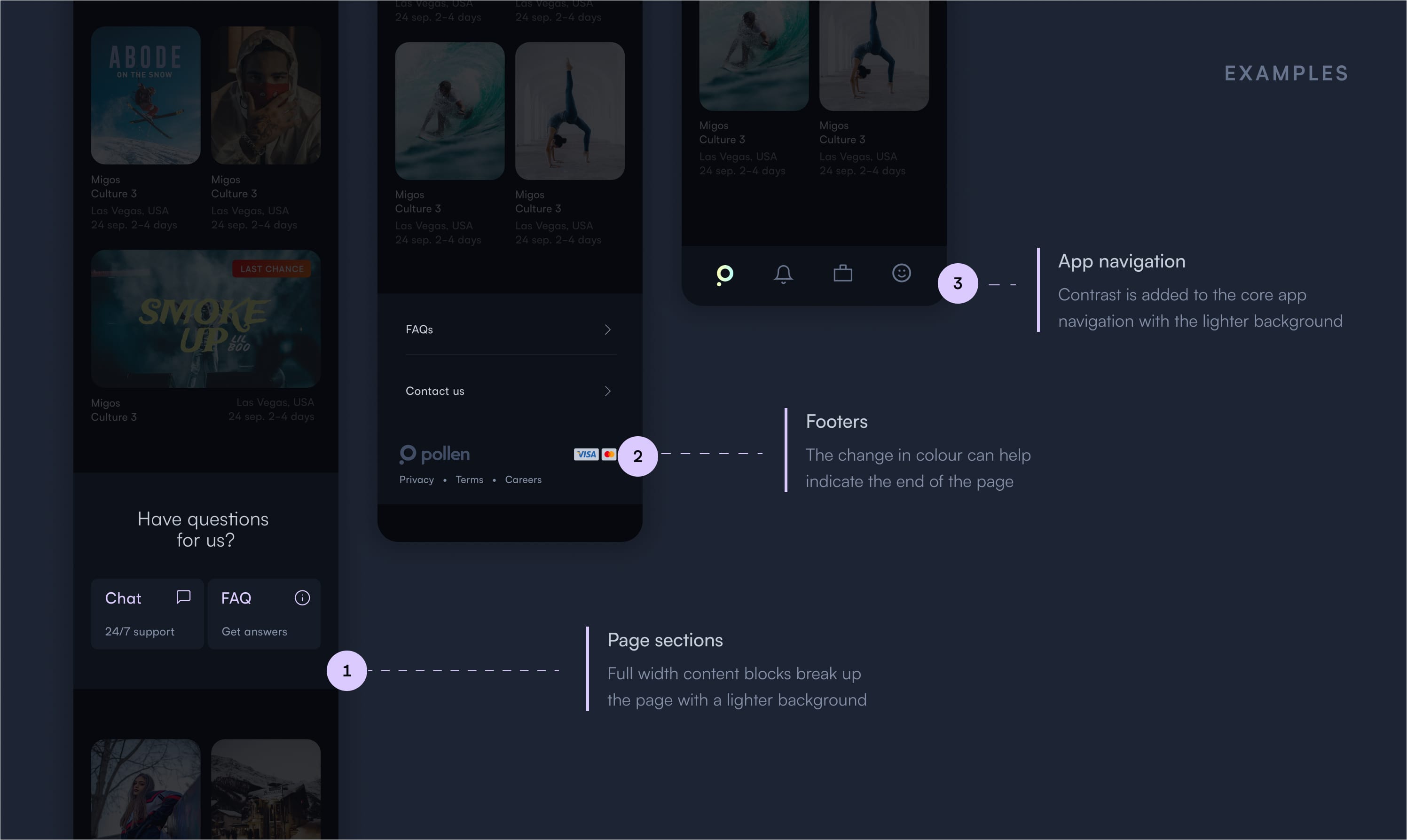
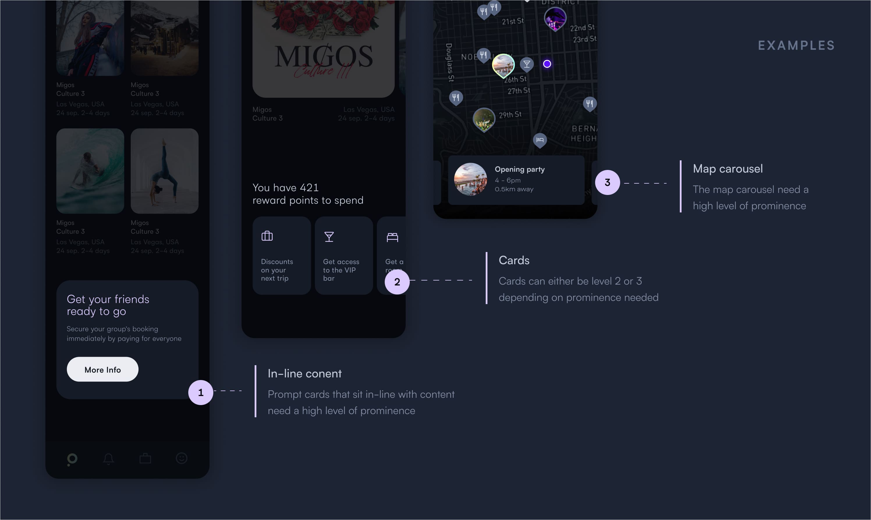
Over 80% of Pollen’s audience engaged with us on mobile devices, therefore spatial and grid systems on the app were a huge focus. We implemented an indent grid to allow designers flexibility on margins while maintaining consistency.
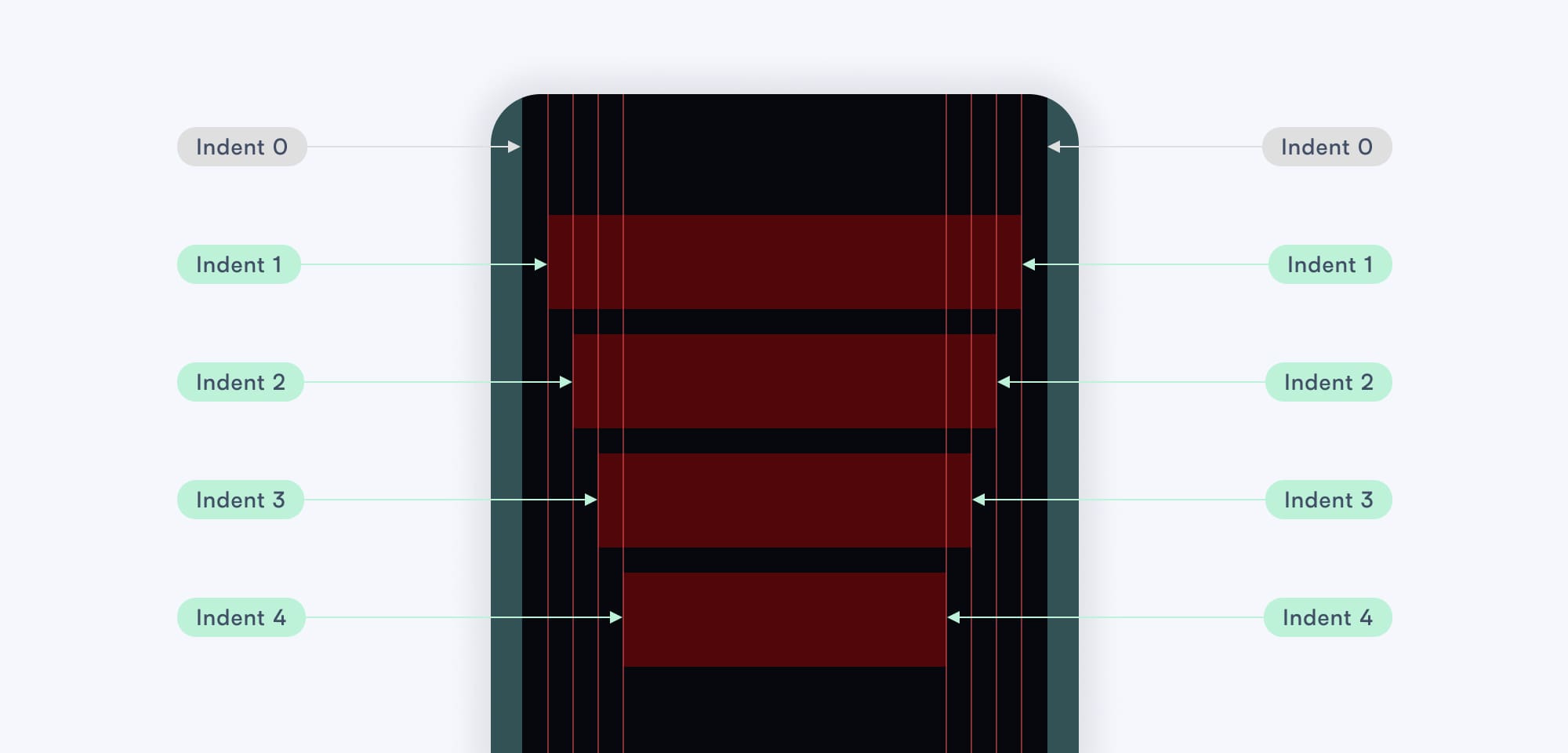
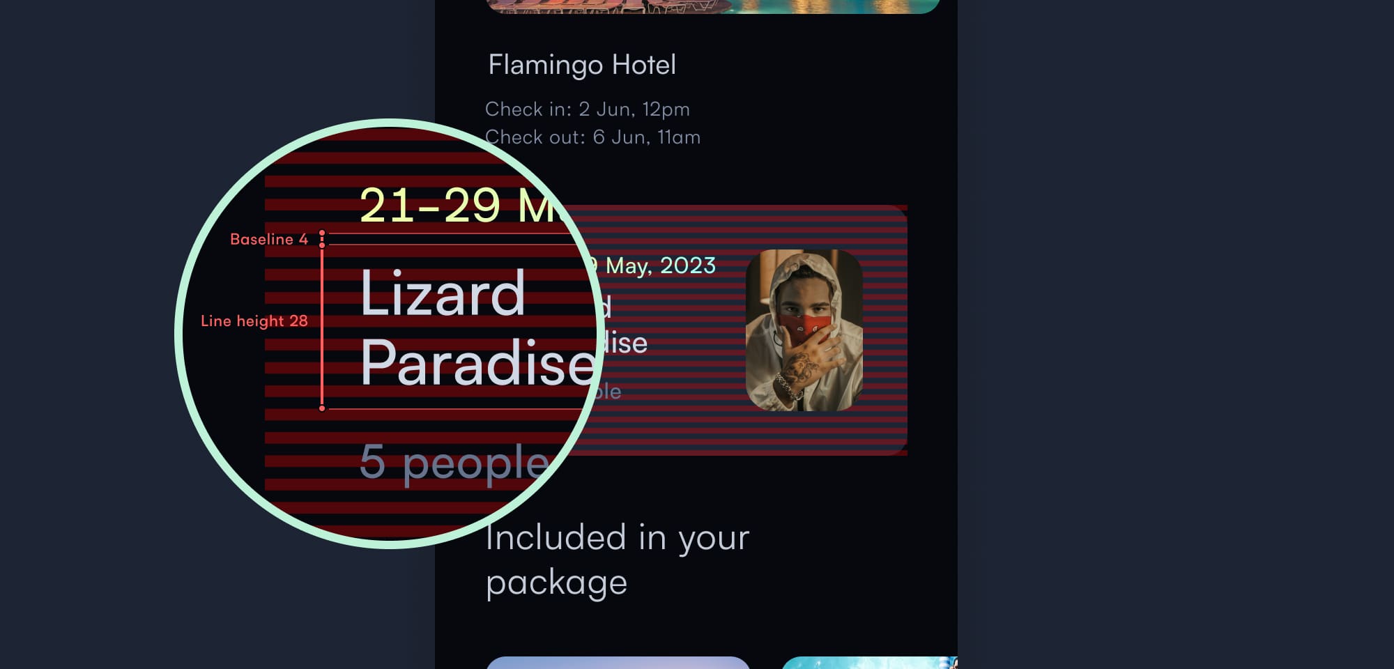
Indent grid and spatial system
We documented the entire system in Zeroheight. This was the best solution in terms of editing flexibility for the team and allowed for integration with engineering tools.
We used Zeroheight for documentation
Upon completion of the project, I worked closely with engineering to convert the old colour, spatial and type systems over. To support the rest of the design team I set up weekly office hours and design syncs. I was able to build extremely strong working relationships with the team and offer my guidance on visuals and utilising the design language.